Silly Staging Tricks Insult Home Buyers
Summary
Staging Diva® Debra Gould, exposes the decorative details which do nothing more than distract home buyers and make the house looked “staged.” These silly home staging tricks risk insulting home buyers.
Silly Staging Tricks Insult Home Buyers
 Afraid you don’t have enough flair for decorating to stage homes? This could be because of those decorating shows and magazines which feature photos of rooms adorned with strategically placed fruit and seashells.
Don’t let something like this stop you from pursuing a career in home staging. While photos of rooms decorated like that might sell magazines, those tactics will not help sell a property. I like to call these decorative touches “silly staging tricks.”
The purpose of home staging is to show a home in a way that people will imagine themselves living there. The ultimate goal is for a potential buyer to walk through the home and have the impression that they’re home already. That’s the end result of a home staging job done well.
Here are some of my favorites from my personal experience or as relayed to me by some of the graduates of the Staging Diva Home Staging Training Program.
Simply creepy
Imagine replacing the real family members’ photos with pictures of more attractive people. Can you believe some stagers even frame photos of celebrities to place throughout a home? Is that to make buyers think the homeowner is friends with Oprah and George Clooney? Sometimes a bad home stager will eve use those frames which hold multiple photos, without removing the manufacturer’s filler pictures.
It’s better to remove all family photos from the home to prevent the home buyer from feeling like they’re invading the owners’ privacy.
There goes my appetite
The kitchen and dining area seem to be popular sites for silly staging tactics. Nothing screams “staged home” like a formally set dining room table, especially when the charger plates are filled with dried lentils. What would you think as a buyer if you found baking accessories strategically scattered around the kitchen island beside a tray of dusty, painted plaster cookies?
Think uncluttered. There is no need for these details and they only distract buyers from viewing the individual rooms as their own home. A fruit bowl on the counter or a vase of flowers on the dining room table is how most people live. Less really is more.
The obviously staged bedroom
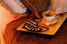
How many times must we be forced to see a tray sitting diagonally on the bed with a couple of wine glasses or a teapot with cups? This might be okay for a hotel honeymoon suite, but normal people don’t live that way. I also can’t understand why stagers place a bed diagonally in a space – I have never seen a case where it worked. It usually just makes the room look weird and crowded.
Worse than a bed on a diagonal, though, is an imaginary bed. Some home stagers will put a rug in a room with throw pillows and some books to represent a bed.
When it comes to the ever important master bedroom, if the buyer can’t walk in and see how their bed will fit or how they can live in there with all their other furniture, they’re going to decide that the room doesn’t work for them. Make sure there’s an actual bed with usable night tables on each side and some nice bedding.
There should be one long dresser (usually with a mirror on top) and one “high boy” dresser or tall chest of drawers. To fit all that in, you may need to use a double bed rather than a queen or king. And be careful with sleigh beds or tall canopies, they shrink a bedroom faster than any other piece of furniture and should only be used in an unusually large bedroom.
The frou-frou bathroom
Although it’s the smallest room in the house, the bathroom is such an important space. That’s why I really don’t understand the great lengths some home stagers go to with their silly staging tricks in there.
Does anyone live with tassels draped over their hand towels in real life? When you put away your bath towels, do you stack them on the bathroom counter, wrapped with a bow and topped with a star fish? Does anyone set champagne flutes out on the edge of the bathtub. I confess I made that mistake myself when I staged my first client’s home. It sold anyway, but in retrospect I think that detail looked silly.
One of the craziest staging tricks I’ve heard of in the bathroom is filling the bathtub with blue-tinted water – especially in the winter for a house in a cold climate! But one of the tackiest things I have seen in a bathroom was a large ribbon tied around the toilet seat lid.
When you’re finished staging a home, you should have created a warm, welcoming environment that a home buyer can’t tell was staged. This means you need a good sense of color and where to put furniture. The property should be de-cluttered, and de-personalized, but not to the point of looking cold, and there should be a logical use for each room.
 A homeowner is not going to fall in love with a home that has lentils on charger plates or a bow on the toilet seat. These things are silly, contrived and a waste of your time.
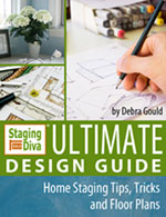
If you want more ideas for how to design for home staging, check out the Staging Diva® Ultimate Design Guide: Home Staging Tips, Tricks and Floor Plans.
About the Author, Debra Gould
Home Staging expert Debra Gould also known as The Staging Diva® knows how to make money as a home stager and has taught over 1000 others to use their decorating talents and run their own home staging business with the Staging Diva Home Staging Business Training Program.
Leave a ReplyCancel reply
©2002-2023 Six Elements Design Group Inc. All rights reserved. Republication or dissemination of this content is expressly prohibited without written permission.
®Staging Diva is a registered trademark, and ™Debra Gould Studio is a trademark, of Six Elements Design Group Inc.
Debra Gould Studio
Designer | Entrepreneur | Author
Shop Our Store!
[…] so much a place practically looks vandalized. Others, add so many cutesy touches and use so many silly staging tricks, they are totally distracting to potential buyers.In his comment, JS assumed staging was a waste of […]