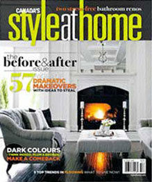
Staging Diva featured in Style at Home Magazine
 Style at Home Magazine, October 2010 Issue
Producer: Sara Cation
Staging for the Sell: Give your home sale a boost with colour picks from Canada’s home staging experts
Home staging expert Debra Gould who is founder of the Staging Diva Home Staging Business Training Program, says, “Many months ago I chose my favorite colors for Style at Home Magazine for front doors, living rooms and master bedrooms. Much to my surprise, the story finally ran in the October issue. I almost missed it, but fortunately one of my clients found the story for me after I’d just finished choosing colors for her kitchen!”
Debra Gould also received a pleasant surprise from a Style at Home reader who looked her up online and wrote to say, “Two painters transformed my front door and (single) garage door with low-luster Caliente, a beautiful red from Benjamin Moore® that you suggested in the October issue of Style at Home. It looks fabulous. Many thanks.”
Home stagers who panic when it comes to choosing colors should read Staging Diva Ultimate Color Guide: the easy way to pick colors for home staging projects where Gould teaches readers how she convinces her clients to repaint their homes to sell. She also includes all of her top color picks for staging and organizes them into different color palettes for the whole home in this guide. The information is organized by room type and for different painting jobs like floors, trim, ceilings, walls, doors and more. The guide includes both American and Candian color recommendations by specific color name and number.
“I guarantee this ebook will save you from spending countless hours trying to wade through the 2800+ colors that Benjamin Moore offers. You’ll create your own swatch deck in no time with what you learn in this guide!” states The Staging Diva.
Style At Home Magazine excerpts of Debra Gould’s tips (colors mentioned are from Benjamin Moore’s Canadian color collections):
“A front door should be welcoming and fairly conservative, yet attention grabbing. Red doors stand out. I like Caliente (AF-290) and Northern Fire (CC-94). If you have red brick use Jamesboro Gold (HC-88), a gold green tone that looks nice with red brick.”
“I think a master bedroom can be a bit darker— I prefer muted tones that stay neutral, like Piedmont Gray (CC-690) or Killarney (CC-698). You want your bedroom to feel mellow and welcoming, and have nothing too bright jumping out at you.”
Leave a ReplyCancel reply
©2002-2023 Six Elements Design Group Inc. All rights reserved. Republication or dissemination of this content is expressly prohibited without written permission.
®Staging Diva is a registered trademark, and ™Debra Gould Studio is a trademark, of Six Elements Design Group Inc.
Debra Gould Studio
Designer | Entrepreneur | Author
Shop Our Store!
Add Your COMMENTs BELOW